THE SHORT ANSWER.
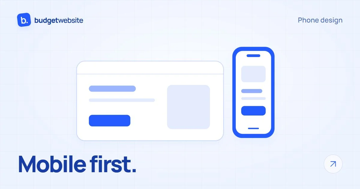
Mobile first means starting the design process from the phone. Readable text, convenient buttons, clear terms and easy contact are more important than the reduced computer-based layout.
A good mobile site starts with the question: what should the customer do when they hold the phone in their hand? Understand a service, find an address, compare a product, or get called. The answer determines the layout long before colors and effects.
The owner often views the project on a large monitor. The client can open it in the bus, between two meetings, or in front of the actual facility. These people don’t need a scaled-down poster. They need a working way to access the necessary information.
Mobile first means starting the design from the small screen. First, we arrange the most important elements for the phone, and then we develop the layout for larger screens. This way, mobile usage has its own logic from the very beginning.
Mobile version of the site: check your visitors
Do not take a universal percentage as the truth for every business. A hotel, a local service, and a provider of professional equipment may have different ways of visiting. The data for the specific site are more useful than a number taken from an unrelated market.
If you have an analytics system set up, review the devices for a suitable period. Compare the actions as well: where are the inquiries coming from and on which pages people are having difficulties. A large number of mobile visits is not the only reason to care about the phone; every suitable customer should be able to use the site.
If you don't have data yet, start with real-life situations. How does the person get your link? Where does they search for the address? What device do they use to open a post on a social network? These questions provide a good starting point, without requiring fabricated statistics.
What does mobile-first indexing mean for Google?
Google uses the mobile version of the content when indexing and ranking. Indexing means the search engine processes and includes the page in its system. This is not a promise of first position and does not mean that the site with the most beautiful phone view wins automatically. Official Google guidelines for mobile indexing.
The practical conclusion is not to hide important information from mobile visitors. The main content, titles, and descriptions should be consistent between versions. The order may be different when it makes reading easier.
If the service is explained in detail on the computer, and only a picture and a button remain on the phone, you are losing useful context for people and the search engine. Instead of removing the necessary conditions, organize them into readable sections. Check what is actually loaded and accessible.
The text that is read is part of the design
Open the page and start reading without zooming in. The main text should be easy to read and the lines should not go beyond the screen. Several large headings do not compensate for the minor details that determine a customer's choice.
Give the text some breathing space with short paragraphs and clear subheadings. The visitor can search for a specific answer, rather than reading from beginning to end. For a service, this could be the time required, for a restaurant the menu, and for a hotel the accommodation conditions.
Check the contrast as well. Light gray text on an almost white background may look fine on the monitor, but it’s hard to read outdoors. The same applies to captions on photos that are differently cropped on a phone.
The buttons should allow for smooth operation.
Try the menu and the main buttons with your finger. Important actions should be easy to recognize and sufficiently separated from each other. It is not good for the person to press repeatedly or accidentally open a linked page.
The contact number should allow for a tap-to-call. If you offer Viber or WhatsApp, test the behavior and provide an alternative for people without the corresponding app. The icon by itself may not explain what kind of conversation it leads to.
For a form, use appropriate fields and clear labels. Do not require detailed company information when the task is just a first conversation. After sending, there should be a confirmation, and if an error occurs, the person should know how to fix it.
The speed and pop-up windows are felt most strongly on a phone.
A good phone website should also work outside the fast office network. The images, video, and external tools should be chosen with the task in mind. The movement can create a sense of quality, but it should not slow down access to the service.
Try the page using mobile data. See if the useful information appears first and whether the buttons respond. If a large image displaces the layout after loading, the person may lose the place where they were reading.
Check the banners, chat, and pop-up offers. When several layers cover almost the entire screen, the visitor should first be able to get rid of them. Leave the content and closing method visible instead of turning the first encounter into a series of obstacles.
Take a five-minute test on your own phone
Choose a task that is actually important for the business. For example, find a specific procedure to follow and keep a conversation going, or look at a product and send a request. Do not use pre-memorized shortcuts.
- Open the homepage and say in one sentence what the business offers.
- Find a service or product and read the necessary terms and conditions.
- Find the phone and check if it can be pressed.
- Fill out the form with a clearly marked test request and confirm receipt.
- Open the same page using mobile data and check the loading and movement of the content.
Ask a person who is not familiar with the site to repeat the task. Observe where they stop without immediately suggesting an answer. This provides more useful information than asking “Do you like the design?”
Adaptive design or a separate mobile site?
Adaptive design means the page changes its layout according to the width of the screen. The content can be on the same address, and the columns, images, and menu can be arranged differently. This is a suitable starting point for many business websites.
A separate mobile site uses different pages or phone numbers. Such a solution requires additional attention to maintenance and content compliance. It is not automatically better just because the address includes a mobile version designation.
Mobile first is the design approach, and responsive design is a way of building the layout. They can work together. The important question is whether the site helps the customer on their device, rather than what technical term is included in the offer.
If the test showed more problems, please also check the other errors on the website. For changes in scope and budget, please use the breakdown of the cost for creating a website.
Let's start from your customers' screen
Is your website difficult to use on a phone? Tell us which actions are important and where people get stuck. We will discuss changes that make the information and contact clearer on a small screen.